
2023
TOP TRENDING
FONTS
If you are a website designer, the fonts you use can impact your site visitors' engagement. There are times when you need to prioritize legibility, and there are times when the fun and fancy font can work.
To help you stay abreast, we listed the trending and eye-catching fonts used in the graphics and web design world.
30 Trending Fonts to Anticipate in 2023
The 2023 typography trends signal a push towards eccentricity and variety. This aligns with the diverse offerings across cinema, streaming, social media, and product branding in the coming years.
As popular culture tends to be more diverse, inclusive, and eclectic, so does typography.
Here are 30 fonts that will likely emerge in 2023:
This lighthearted 2023-type trend will bring a dose of positivity to any design. Goofy Sans Serifs balance the plainness and clean lines of a sans serif with the characterful essence of a display style. A little cartoon-inspired without wandering into a childlike territory, these goofy typefaces are the perfect companions for informal designs or brands seeking a playful quality.
As a family of 18 fonts, the Niveau Grotesk is professional-looking yet fascinating. Some letters feature incredible, yet subtle, slants.
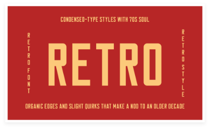
Expect to catch more high-impact condensed-type styles with 70s soul. Whether solid and cinematic or more rounded and organic, condensed typefaces are excellent for influencing a small space.
These fonts soften the sometimes rugged style that condensed typefaces have, with organic edges and slight quirks that make a nod to an older decade.
Bring a touch of romance and facilitate a Dark Academia mood with this bookish trend. Style your serifs or calligraphy fonts with a combination of weights, breaking into a few italics for the ultimate scroll-like style.
This style of setting typography looks quite authentic when combined with papery color palettes and hand-scrawled elements such as underlines, circling, and editor-style margin notes.
Clavo is a family of 20 serif fonts. It draws readers with subtle details, classical forms, and traditional ratios. This font is a very readable and clear one.
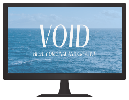
Void is a highly original and creative display typeface featuring blobby shapes with a magnetic fluidity that presents otherworldliness.
Designed by Malte Bentzen, Void incorporates a range of references from science fiction to 1990s visual culture to form a unique visual language. Available in a variable setup and with three static weights (thin, regular, and bold), you will draw attention using this font in display applications.
When a font foundry makes a typeface for its website, you know they're going to come up with something extraordinary, and that's certainly the case with Foundry Unie.
It is round, open, and minimal and highlights a large x-height, clean appearance and optical recognition features. This makes Foundry Unie a good choice for neutrality and clarity.
You can tell by the name that Novela is a font developed for reading. But this sleek display serif is anything but bland, thanks to its abundant x-height, sharp terminals, and extreme stroke contrast. It can work perfectly for posters, packaging, logos, and anywhere else where you require text that oozes class and style.
Keep in mind that the Regular style is available as a free download for personal use, and you can 'pay what you want for the complete font family.
Voyage is a form of vintage, cursive script. This font has three more in its family that incorporates light and bold options. The people find it smooth and inviting.
Classic modernist typefaces just don't go out of style. These effortlessly stylish and versatile type styles, emanating from the golden age of Swiss graphic design in the 1960s, simply sit back while modern font fads come and go. In 2023, we will likely see these classic, Swiss-style sans serifs in print layouts and digital designs because of the font’s versatility.
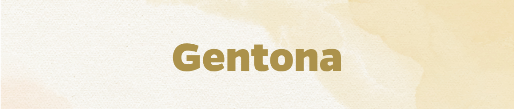
Gentona’s main goal is to be neutral. It was developed for a variety of applications. It’s a neat sans-serif font that will not divert the reader's attention.
Developed by Francesca Bolognini and Mat Desjardins, PP Fragment is inspired by vintage lettering and characters. It aims to furnish a bridge between 19th-century letterforms and modern typography.
It comes in four presets (Serif, Sans, Glare, and Text), each with particular quirks, highlighting 32 distinct weights. Each weight counts 581 glyphs with plenty of alternate characters to make it more versatile.
If you're looking for something a bit different, Roman Grotesque takes two apparently opposing traditions. It features the structured form of sans serifs and the calligraphic heritage of serifs.
The italic styles follow the classic design serif structure. Originally designed as part of a visual identity created for the National School of Architecture Paris-Belleville, this font can be used in eight weights with their italic equivalents.
Created by Martin Vácha and released in 2017, Reckless is a serif text family with a renaissance look and a significantly boosted x-height. This font brings the nature of calligraphy into renaissance construction with its six weights, 12 styles, and numerous alternates.
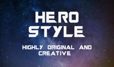
The year 2023 is a stellar year for action-hero blockbusters, with movies like The Marvels, Indiana Jones 5, and new installments of the Guardians of the Galaxy and Mission: Impossible franchises.
The cinematic mood for 2023 is set to be entertaining and action-packed, and designers can convey the same sense of pulp fiction optimism to their designs with superhero-inspired type. Opt for a retro style to pay homage to the original Spielberg era of Indiana Jones and The Goonies, or turn to metallic textures and eye-popping 3D styling to obtain an action element to designs.
While this trend won’t suit some projects, it’s a surefire way to inject designs with instant energy and lure eyes toward branding for events, websites, or social media.
Magazines of this era supply the inspiration behind this trend, with curvy editorial styles like Mullingar making for surprisingly natural matches to contemporary design elements. Fuse these trending fonts with neon palettes for a stylish appeal. You can also pair them with tongue-in-cheek retro-styled photography for editorial designs, social media, or websites.
Rolling Pen is a stunning, light script that emulates an ink pen. The thin lines make this font a pleasure to read. And it also comes with five more fonts.
Minipax is a free, open-source font inspired by George Orwell's novel 1984. It was developed to produce the atmosphere of the dystopian world it describes. Designer Raphaël Ronot wanted it to be as comprehensive as possible since large glyph sets are rare in the world of open source. That’s why you'll encounter plenty of alternates, ligatures, special characters, and diacritics to play with.
Core Circus is an absolutely fun font family with vertical stripes to shade in the characters. The characters in this family can also have a thick shadow that makes them pop.
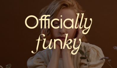
Officially Funky is a two-in-one font with a funky vibe that fuses the contemporary cleanness of sans with alternate serif letters and cool ligatures. The font also incorporates over 45 ligatures, full language support, punctuation and numerals, and detailed instructions on utilizing alternate letters in apps such as Canva.
Another gloriously OTT, 1970s-inspired font, BN Modern Ombra, is a modern interpretation of the classic Motter Ombra. It was developed by Othmar Motter in 1973 and digitized by Linotype. Brandon Nickerson applied geometric circles and teardrop shapes to form this new interpretation and completely remodeled certain letters. BN Modern Ombra would suit well in layouts, headlines, and logos.
There’s always a place and time for a tech-inspired typeface, particularly in the internet age. And with sci-fi creating waves in cinema and streaming, there’s never been a great time to incorporate a little space chic into your designs.
For businesses trying to appear forward-thinking, a font that creates a subtle nod to science fiction or technology will be the perfect fit while keeping clear of the novelty domain.
The original Subtle Sci-Fi type choice is FF DIN, a slightly reduced grotesque sans serif with an analog appearance. However, for a more cutting-edge font preference, try Estero or MBF Advanium. Apply them for corporate branding projects or website designs requiring more bite and interest.
This bold sans-serif font is excellent for headers since all letters are uppercase. There is a mixture of styles in this family of 19 fonts.
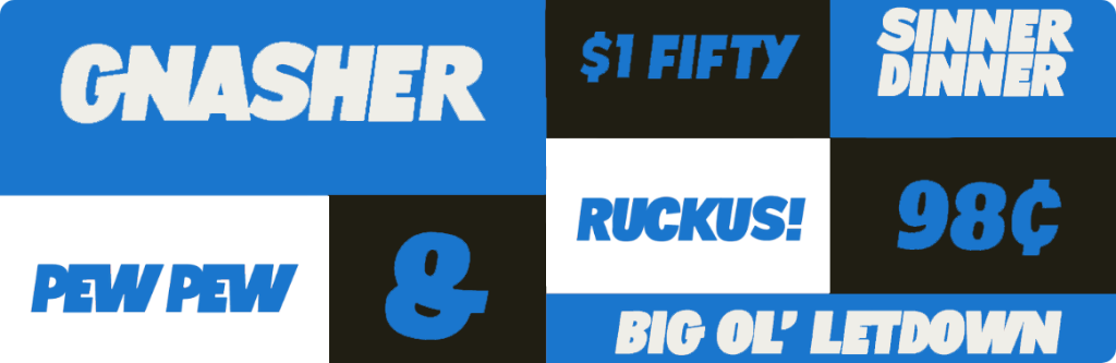
YRT Gnasher has nothing to do with The Beano character but has an entertaining comic-book look. Created by Zac Neulieb, this super blocky font is developed to remind you of the block letters that covered your notebook in high school. The lowercase and uppercase have variations between each letter to help present your type design with more of a hand-rendered quality.
Love serifs? New Eddy goes the extra mile with its long, lean lines and high-waisted capitals with caricature-like characteristics.
Released in 2020, this display face was created by Eliott Grunewald and is currently used in uppercase only.
Designed by Yoann Minet and first released in 2018, Stratos is a geometric grotesque with exciting ideas about proportion. By eschewing conventional concepts of typographic relationships, it can empower designers to do more compelling things with type.
However, there’s a notable difference between its upper and lower case sets. The caps are packed, inspired by the gothic wood type of the 20th century. At the same time, the minuscules are akin to precise classic geometric sans serifs, with circular rounds (o, d, b, p, q) and horizontal terminals (a, c, e, g, s).
Bull-5 is a revitalization of a particular Olivetti typewriter font style that emerged in the 1960s. Designer David Einwaller developed it by digitizing printed-type models from brands of photographic prints from a newspaper's 1980s archive.
With a basic and mechanical character, Bull-5's Regular Style offers perfect legibility. It also comes in Mono and Slab-Serif styles.
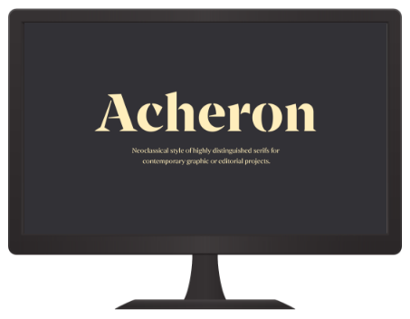
Another serif with bucket loads of charisma, Archeron Pro reinterprets the neoclassical style of highly distinguished serifs for contemporary graphic or editorial projects.
Released in 2019, it delivers high-contrast character ratios and a high x-height to provide sentences of body text with more rhythm and legibility. The font also offers a complete set of small capitals with a little more pressure than uppercase.
Boogy Brut is not just a typeface exploited by calligraphy but one with calligraphy's DNA at its core. Sharply modeled shapes expose the structural qualities of the written models but do away with the handmade flaws caused by writing tools or the texture of the paper. A synthesis of various experiments by Julien Priez, this font is a beautifully functional design that will deliver a highly original look to your designs.
Not sure whether you prefer a sans or serif style? GT Ultra is created to offer the best of both worlds.
Released in 2021, GT Ultra pulls inspiration from the clunky, chunky, and funky flare serif typefaces from the 1970s and 1980s. They take cues from their embellishing aesthetic to craft something new. The narrower balances of the Italic are poised by its lighter weight and steeper terminal strokes. This allows it to integrate into geometric slanted sans and serif italic on an interpolable axis.
FINAL THOUGHTS
In retrospect, it’s clear that typography played a role in soothing and reassuring consumers in a post-pandemic climate.
Mincho-inspired serifs cultivated a sense of tranquility, in line with the Japandi trends we saw across other design fields last year. On the other hand, serifs conveyed authority and stability into business brand identities.
Remember that the fonts you use should cater more to your viewer’s needs than your pleasure. Daring, fun fonts are undoubtedly pleasing to look at but often are not suited for large blocks of text

TALK TO US
GET STARTED
Virtual Bears is here to help bring life to an idea that will make your business grow. Request a quote today to get started!